My posts may include paid links for which I earn a commission.

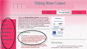
While I was checking out all of the SEO functions of some new Firefox extensions I installed, I happened upon Archive.org and the Wayback Machine. Out of curiosity, I went back and looked at the first week of the first site that I ever launched. It was 2004 and my site Helping Moms Connect was brand new. After my initial laugh at the site, I started looking more closely at what has changed and what has stayed the same over the last 6 years. Although I completely scrapped the site a little over a year ago and started fresh, it was interesting to see what stayed the same and what changed.
See Helping Moms Connect in 2004
Major differences:
Then: Frontpage (which most other people at my skill level at the time were using)
Now: WordPress (which most other people at my skill level are now using)
Then: Pink! I thought if it was for women, it should be pink. Thankfully, I realized I was wrong.
Now: Green and yellow. A little more neutral.
Then: No advertisements. I hadn’t discovered affiliate marketing yet.
Now: A few banner ads on the main site and some tasteful text links.
Then: An email address and phone number to communicate with me.
Now: Twitter, RSS feeds, and newsletter.
Similaries:
When I look past those huge differences, I actually end up with a whole lot of similarities. A straightforward header with our name. Basic navigation to categories. Articles for moms that are updated at least a couple of times each week with female-friendly topics.
Despite a complete overhaul of the site, including moving it from hand coded HTML to a blog platform, I stayed true to my original purpose when I started the site. I always wanted Helping Moms to be a source of good content first and revenue second (and that is definitely still the case!).
How have your sites evolved over the years? Are you still true to your initial purpose? Has what you learned online changed your perspective and as a result your website?
Except the site bg color i like the template 🙂 Simple and colorful 🙂
Cheers.
.-= Robin´s last blog ..WP Robot Discount Code 91 Off from 220 =-.
Woah! What a big difference a couple-few years make.
.-= Panda´s last blog ..Unscrupulous Trial–Product Merchants =-.
Well, I must say that the improvements were very dramatic. Your current one looks so much more professional. I tried the WayBack site on my blog but it seems it’s not old enough to register. Maybe I’ll give it another shot in a few years time.
.-= Sire´s last blog ..How To Save Time Replying To Comments =-.
You are smart that you skipped straight to the “professional” look instead of going through the ugly duckling years like I did. 🙂 Thanks for checking out my post!
It’s funny-having your phone number on a web site seems so dated!
.-= Hedy´s last blog ..Drive an IndyCar at Disney World! =-.
And I listed my “electronic mail” address. LOL